
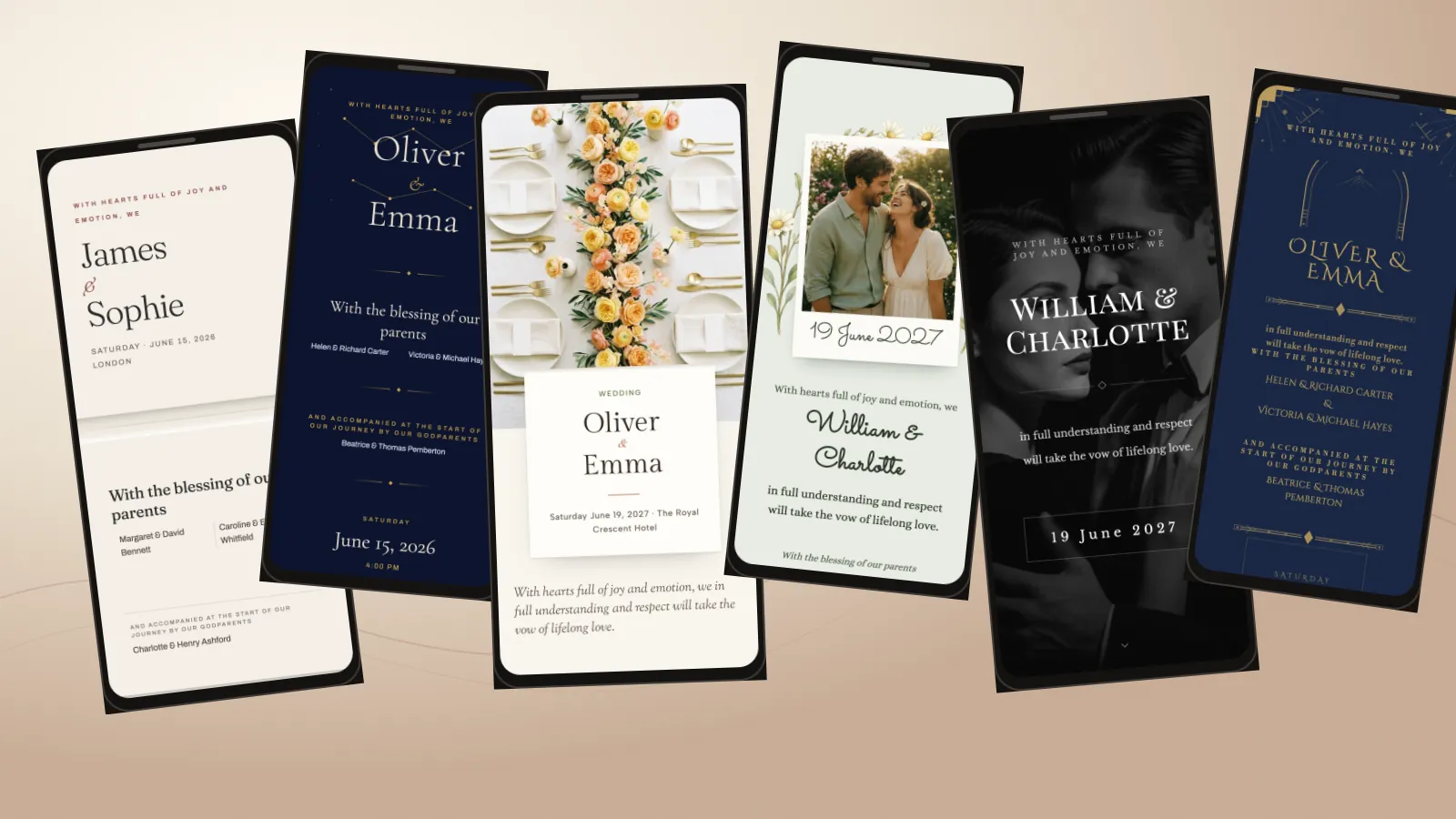
These 21 digital wedding invitation examples range from folded-paper and botanical designs to coastal photography, editorial grids and dark evening themes. Each is a current Saventify template preview with sample English details, not a customer invitation.
A preview image shows the palette and first screen. The public template page lets you inspect the current layout without signing in, but its non-animated preview does not test the invitation opening or save an RSVP. Test those actions on your own guest link after you personalise a shortlist.
Public English previews
Choose a direction, then preview the template
Filter by the setting or look and mood you have in mind. Every card uses a current English-language preview image and links to its public template page.
Filter invitation examples
21 examples shown
What you see
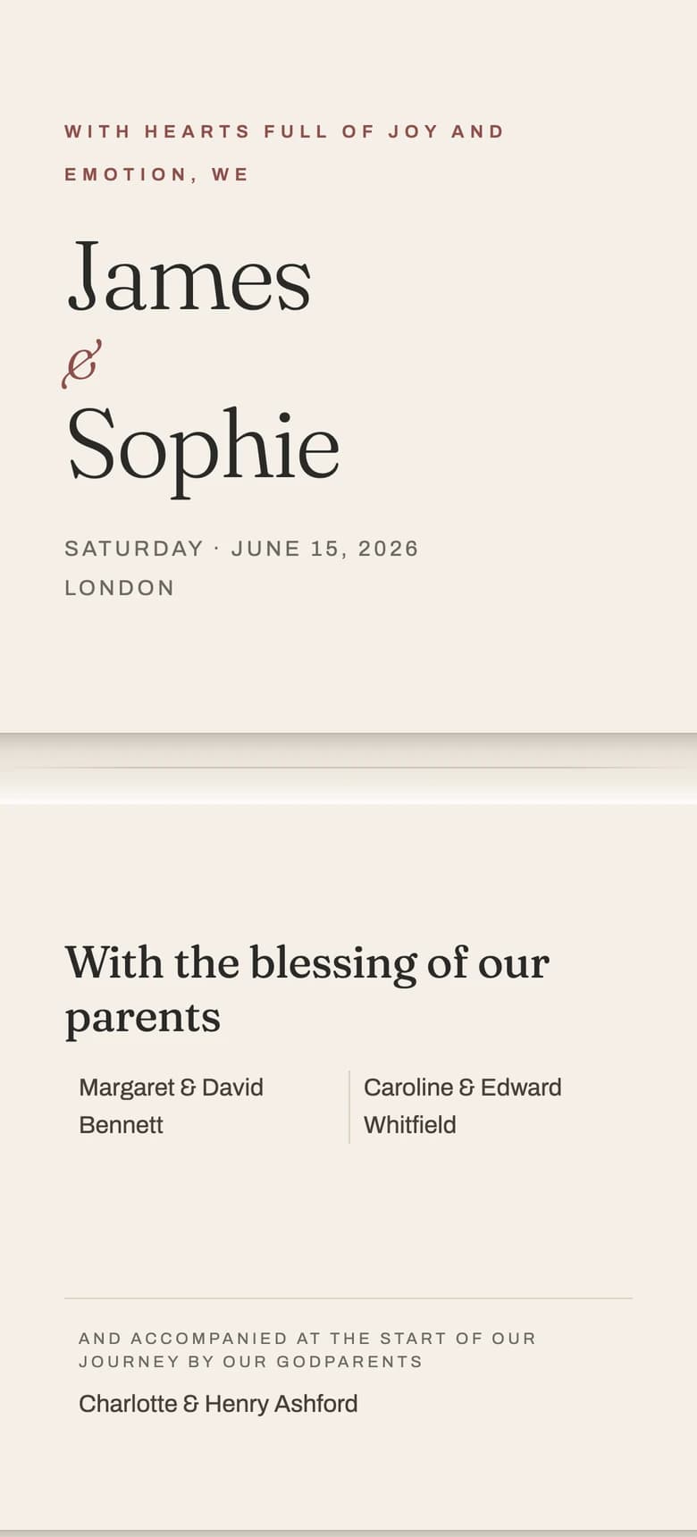
Le Pli
Warm folded paper, fine rules and one blush accent. Each section feels like a new stationery panel.
- Where it fits
- A registry-office ceremony, restaurant reception or small city wedding with restrained details.
- What to check
- See whether the names and wedding date remain clear before you begin to scroll.
What you see
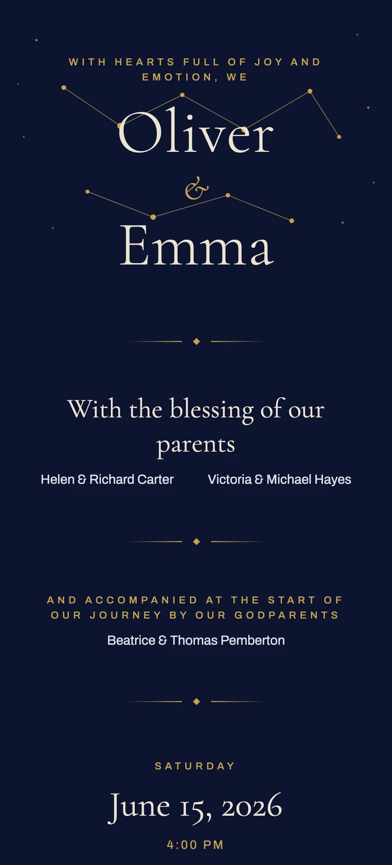
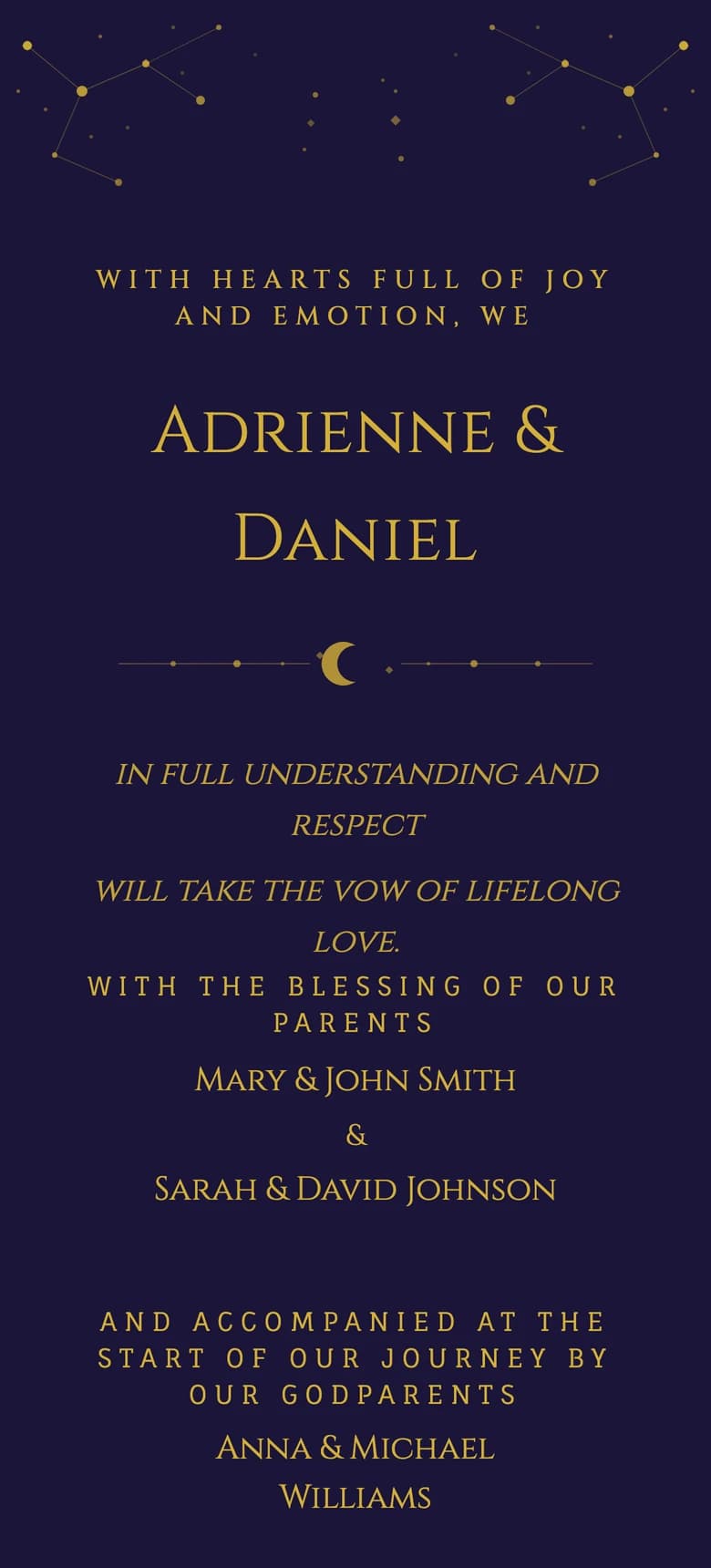
Aurelia
A midnight-blue star map with ivory type and small gold points of light.
- Where it fits
- An evening ceremony, observatory reception or winter wedding under a dark sky.
- What to check
- Turn down your screen brightness and check whether the fine gold details still frame the information rather than compete with it.
What you see
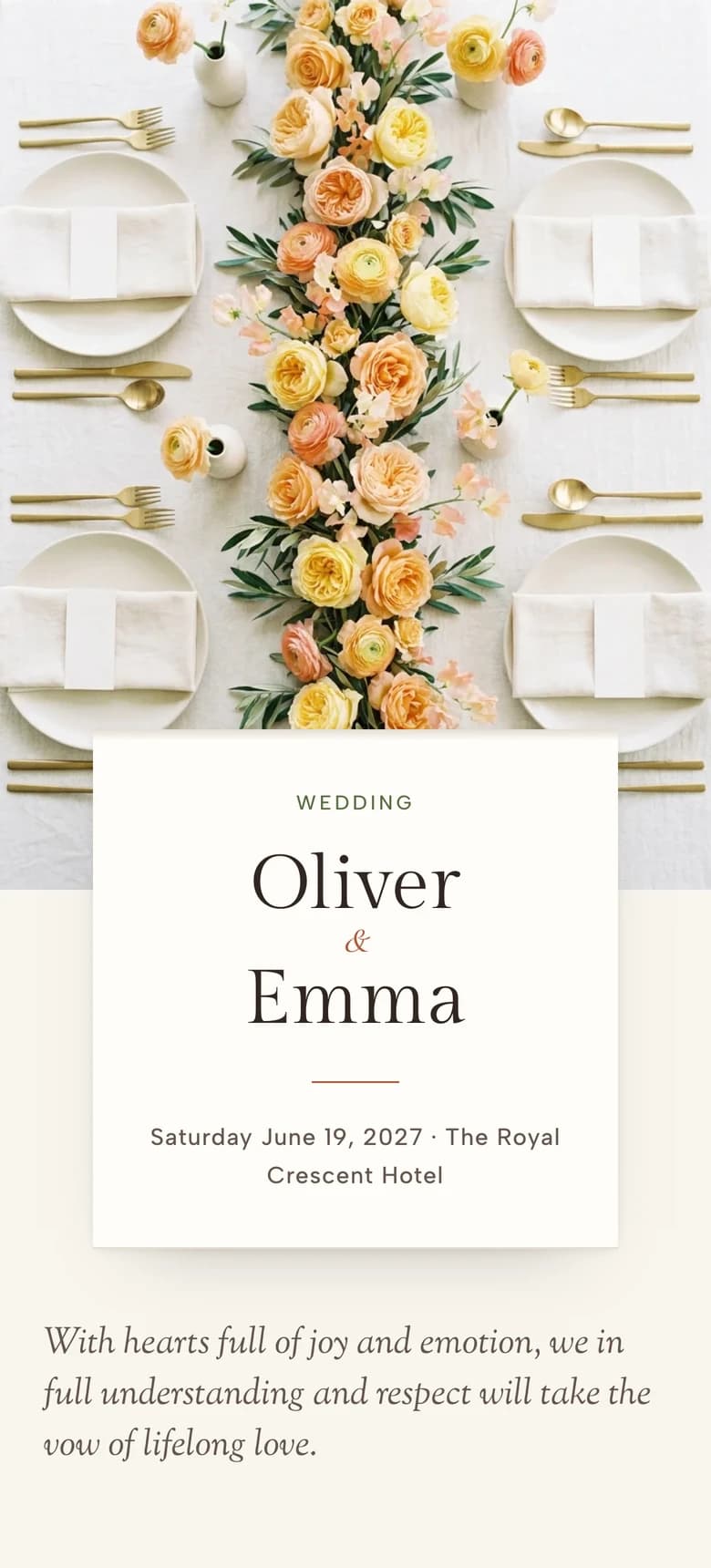
The Long Table
An overhead reception table with ivory linen, garden roses and each section resting on the cloth.
- Where it fits
- A long lunch, dinner at a private house or a wedding around one long table.
- What to check
- Follow the invitation from the first place setting to the event details and notice whether the visual idea stays useful as the content grows.
What you see
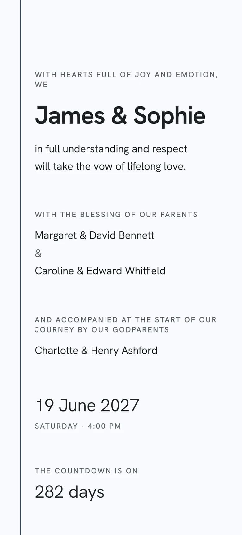
Modern Minimalist II
Graphite type on cool white paper, one rule and a single venue photograph.
- Where it fits
- A gallery, courthouse, modern hotel or architectural city venue.
- What to check
- Notice whether the typography leads you from the names to the date before the single photograph draws your attention.
What you see
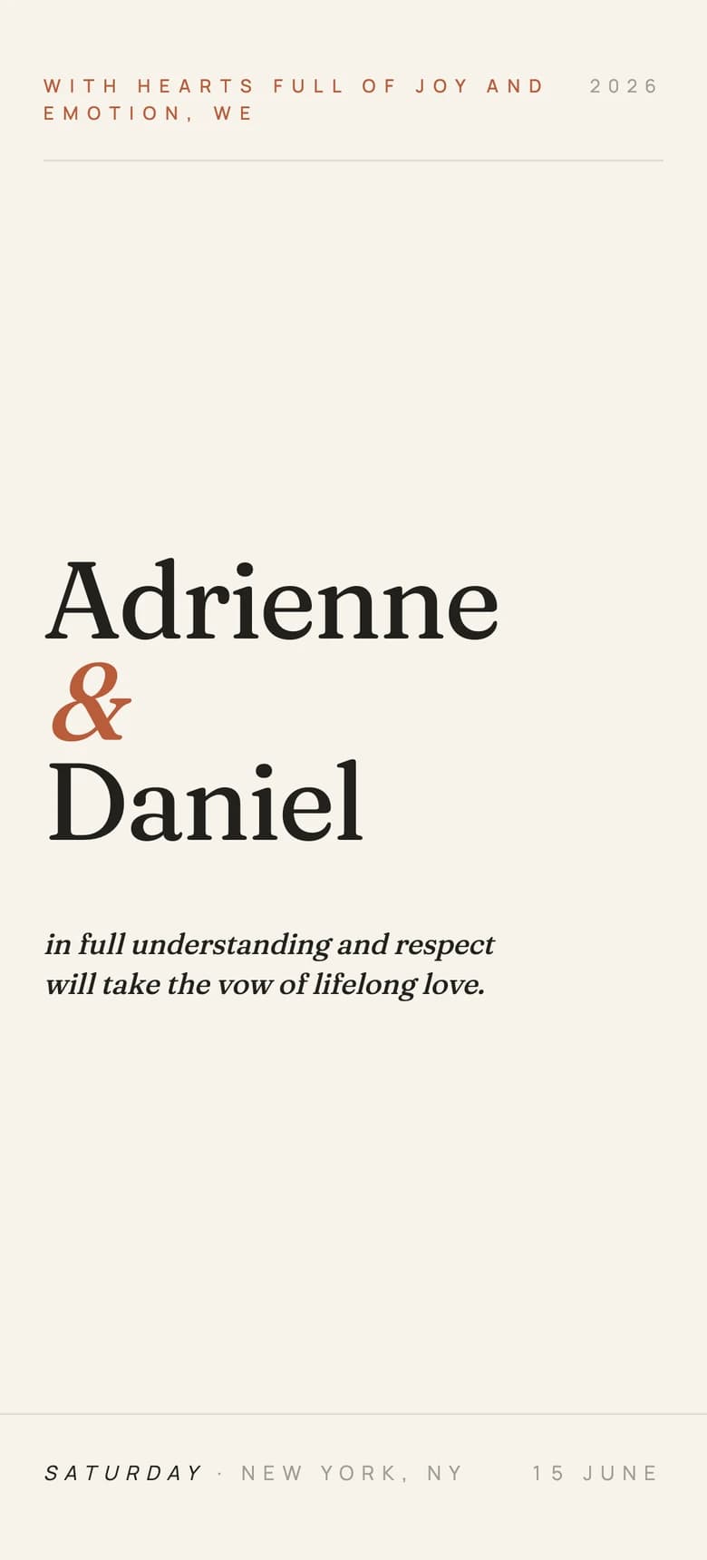
Editorial Minimalist
A numbered magazine sequence with Fraunces type, wide margins and terracotta marks.
- Where it fits
- A design-led city wedding, converted studio or contemporary restaurant.
- What to check
- Check whether each numbered section helps you find the date, venue and RSVP button on a return visit.
What you see
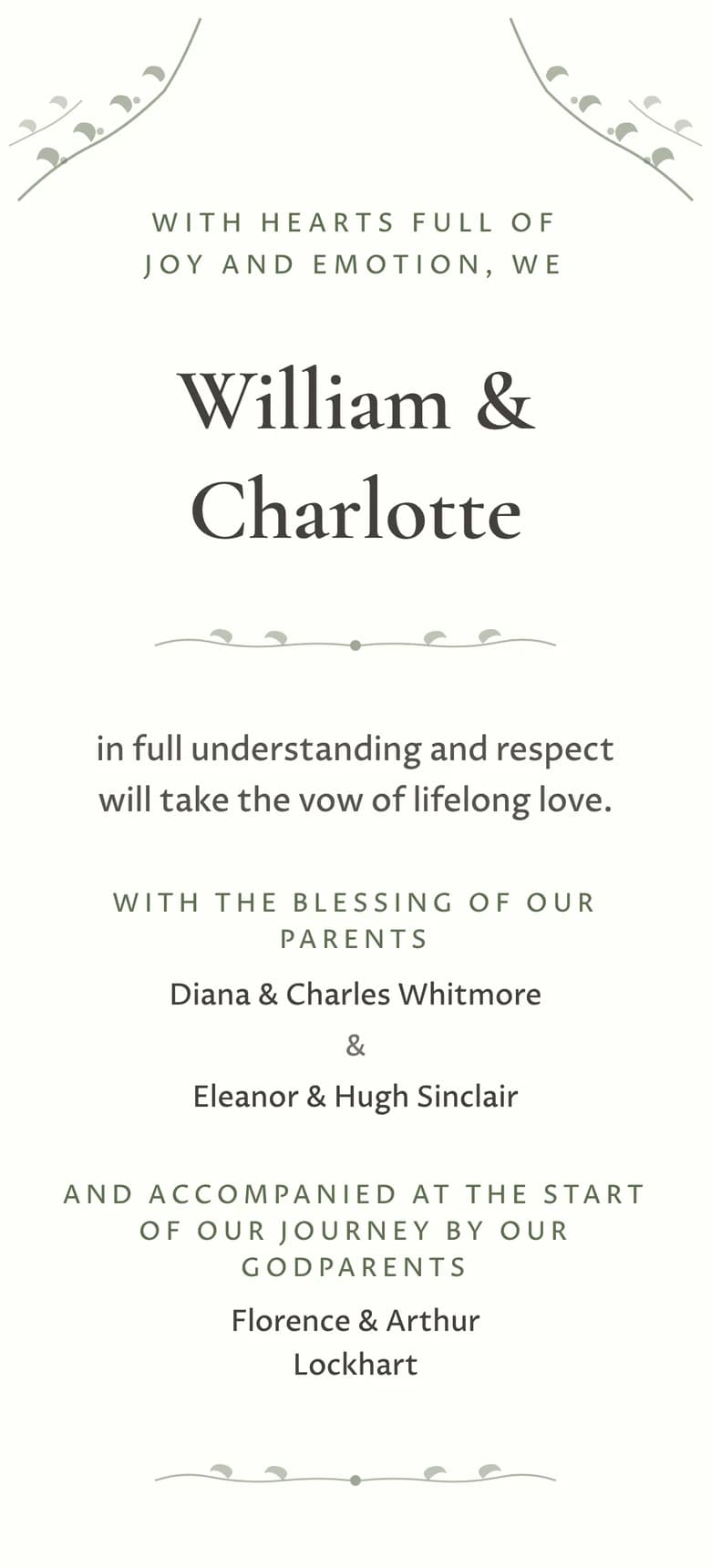
Botanical Garden II
Fine green branches, centred serif type and generous ivory space.
- Where it fits
- A glasshouse ceremony, country garden or spring lunch with quiet floral details.
- What to check
- Increase the text size and look for any place where the delicate frame crowds the wording.
What you see
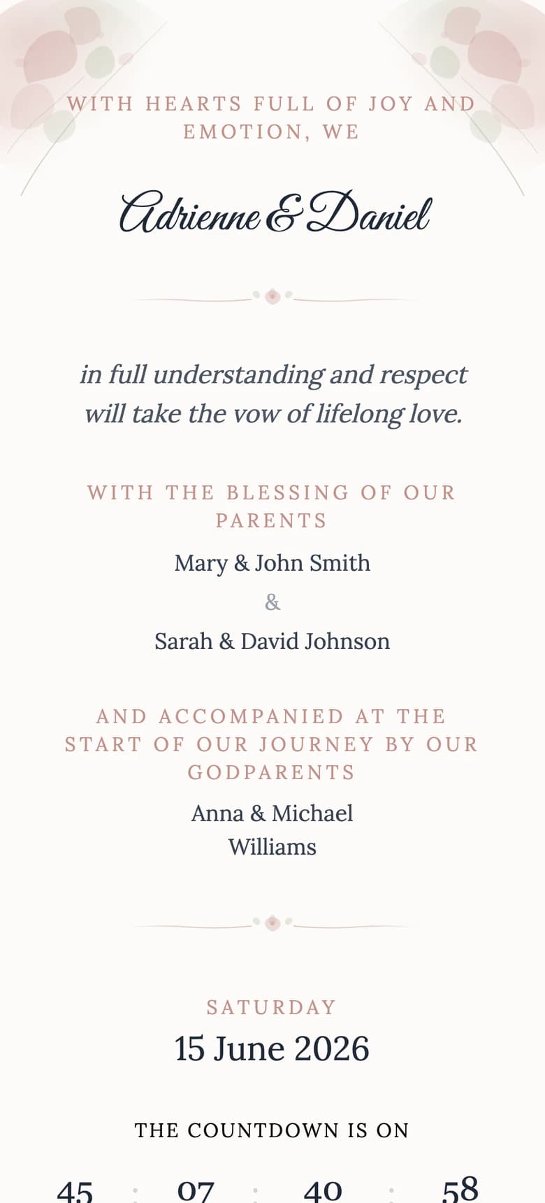
Watercolor
Dusty-rose washes and hand-drawn dividers around a light paper ground.
- Where it fits
- A summer garden, manor-house lunch or ceremony built around soft colour rather than heavy ornament.
- What to check
- Check whether the pale paint and the text retain enough separation in bright daylight.
What you see
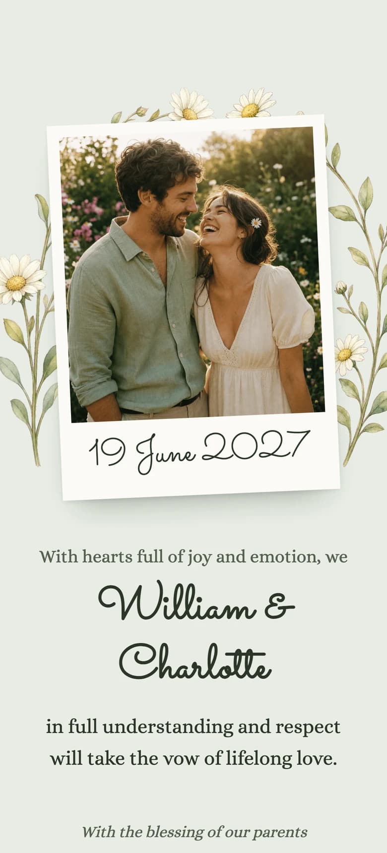
Garden Party II
Tilted instant photographs, wildflower stems and olive ink on sage paper.
- Where it fits
- A marquee, orchard, back-garden reception or relaxed afternoon outside.
- What to check
- Look at the balance between photographs and practical details. The pictures should set the scene without hiding the time or place.
What you see
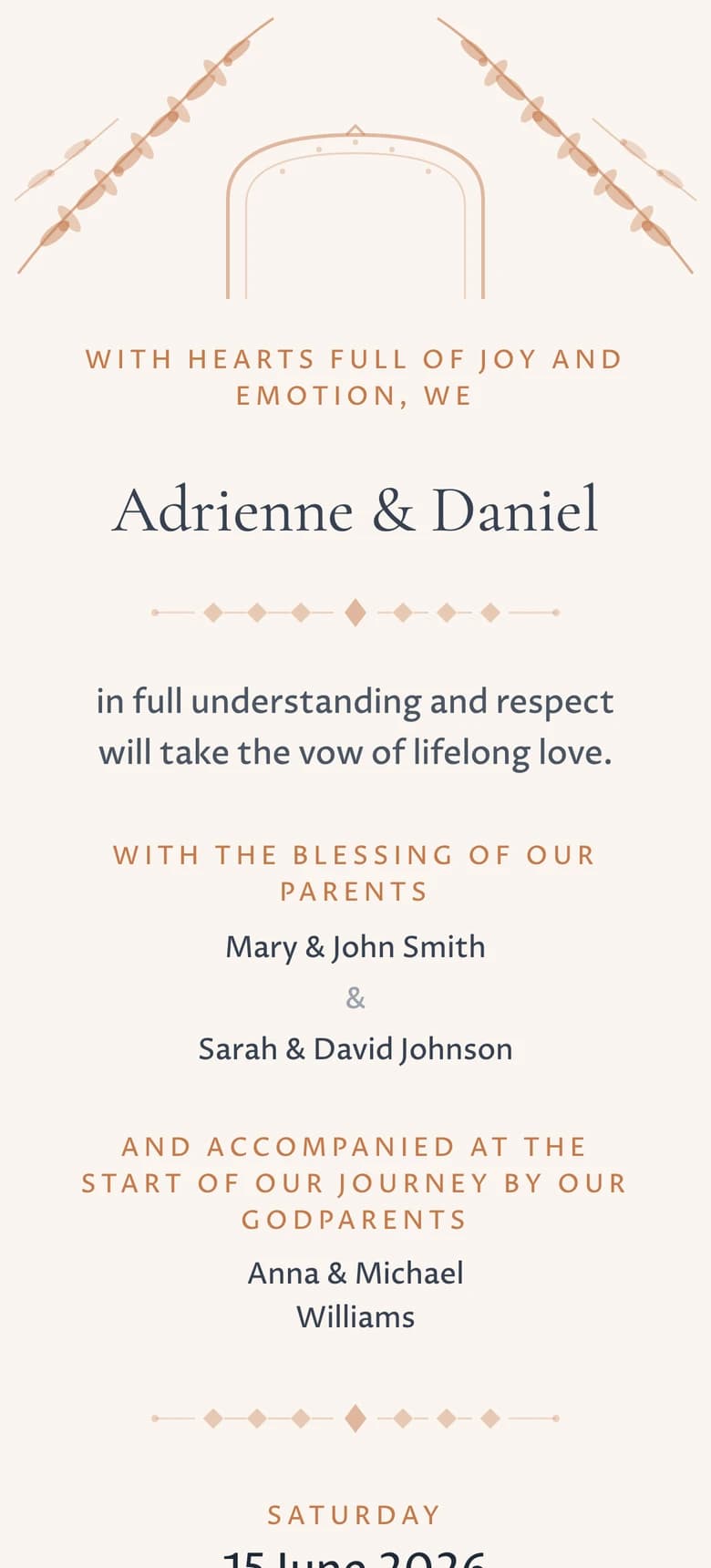
Mediterranean
Olive branches and terracotta arches on a warm white background.
- Where it fits
- A courtyard dinner, coastal villa or destination wedding in dry summer light.
- What to check
- Enter your longest venue address in the editor and check that the arches leave every line enough room.
What you see
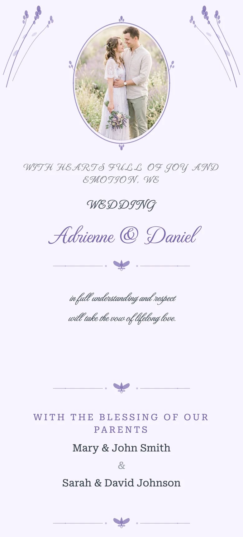
Provencal Lavender
Lavender sprigs, an oval portrait and small French-inspired dividers.
- Where it fits
- A farmhouse, vineyard or stone terrace with a pale lavender and cream palette.
- What to check
- Check whether the oval portrait supports the names and date without becoming the only part you remember.
What you see
Rustic Bohemian
Kraft-toned paper, earth colours and a warm countryside feel.
- Where it fits
- A barn, lodge or woodland reception where natural texture already shapes the room.
- What to check
- Check that the tactile styling still reads as deliberate on a small screen rather than as a scanned paper card.
What you see
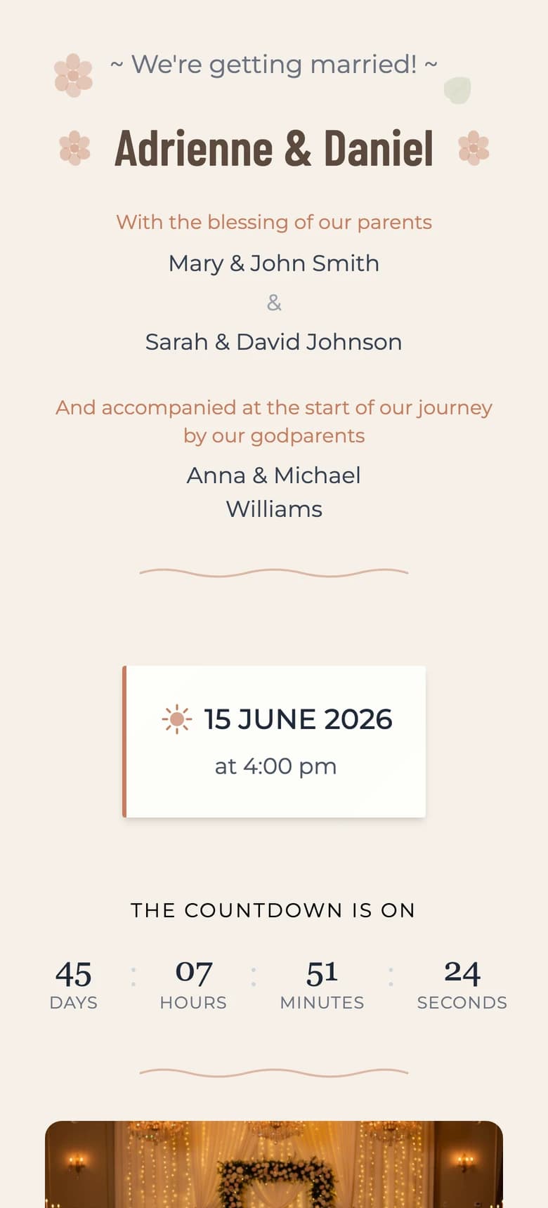
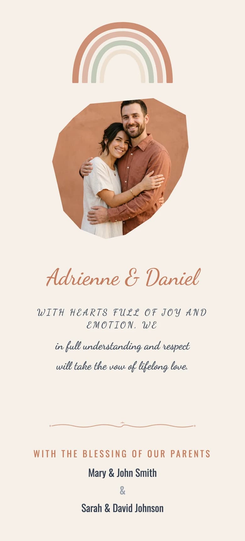
Boho Terracotta
Terracotta curves, an organic portrait frame and compact modern type.
- Where it fits
- A desert garden, festival-style weekend or laid-back outdoor ceremony.
- What to check
- Check whether the graphic shapes guide your eye toward the names and date before the photograph.
What you see
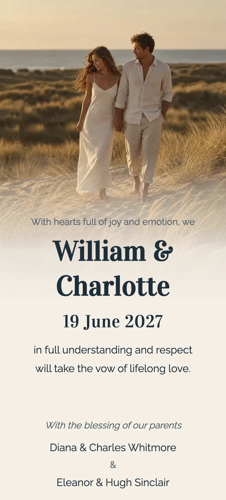
Coastal Dune II
Full-width dune photographs, sand-toned paper and navy typography.
- Where it fits
- A beach ceremony, coastal weekend or reception beside open water.
- What to check
- Check whether the photographs establish the place without making the date and venue harder to find.
What you see
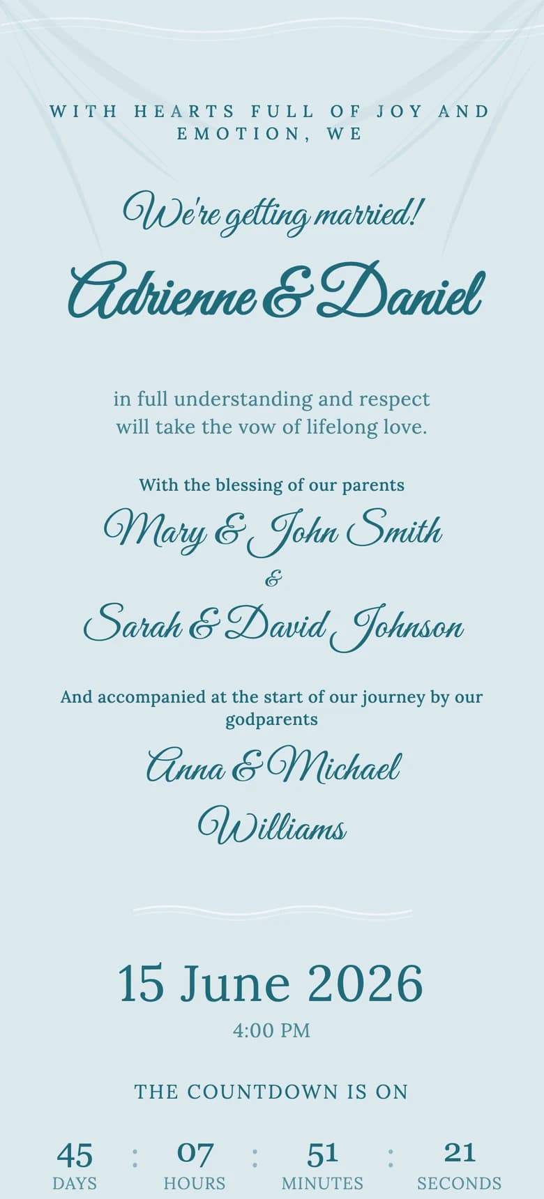
Tropical Beach
Palm leaves, ocean blues and a brighter destination palette.
- Where it fits
- A tropical resort, beach club or warm-weather wedding with a relaxed dress code.
- What to check
- Check whether the brighter colour still leaves the schedule and reply details easy to scan.
What you see
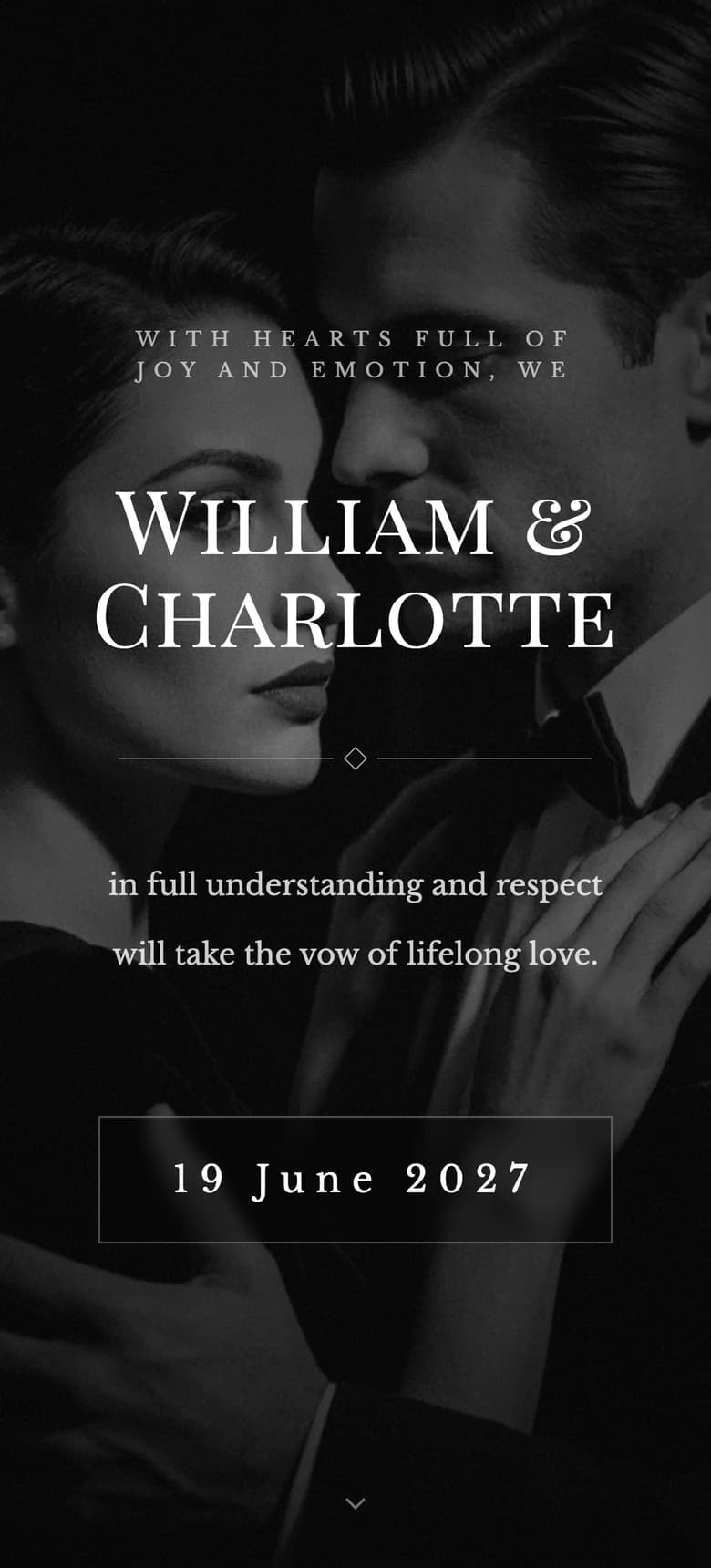
Film Noir II
Black-and-white couple photography, silver type and a closing title-card rhythm.
- Where it fits
- A black-tie evening, old cinema, city hotel or reception after dark.
- What to check
- Check whether the couple and date remain clear against the black-and-white photograph before you scroll.
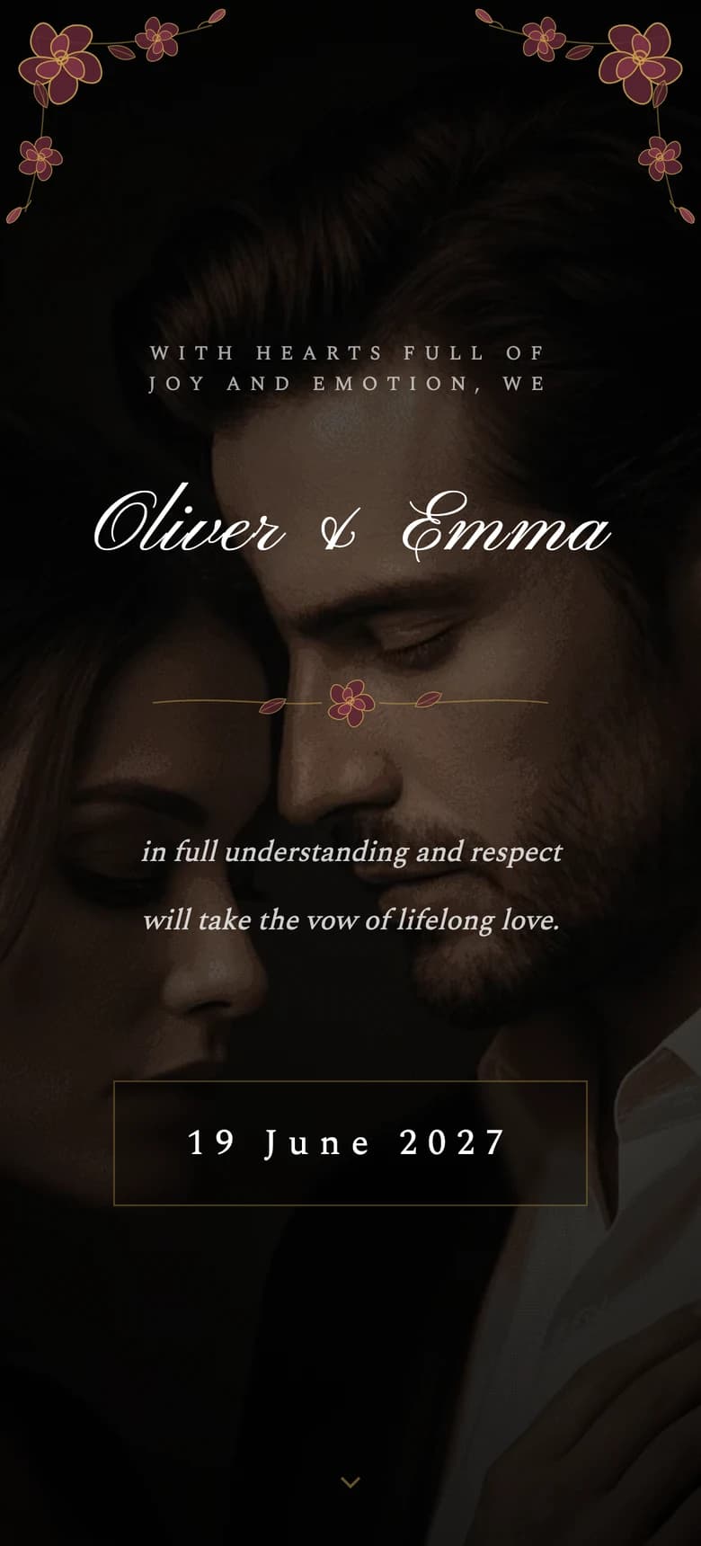
What you see
Moody Floral II
Burgundy roses, warm ivory type and fine gold detail on a near-black ground.
- Where it fits
- An autumn dinner, candlelit hall or late ceremony with deep floral colour.
- What to check
- Check the smallest lines at low brightness. Dark atmosphere should not cost the guest the address or reply deadline.
What you see
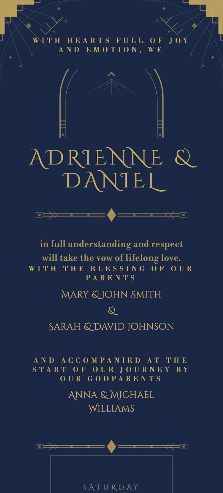
Art Deco
Symmetrical gold fan motifs and gateway arches on navy.
- Where it fits
- A ballroom, theatre, members’ club or formal city reception.
- What to check
- Look for the moment ornament stops and information begins. The date and venue should remain the strongest landmarks.
What you see
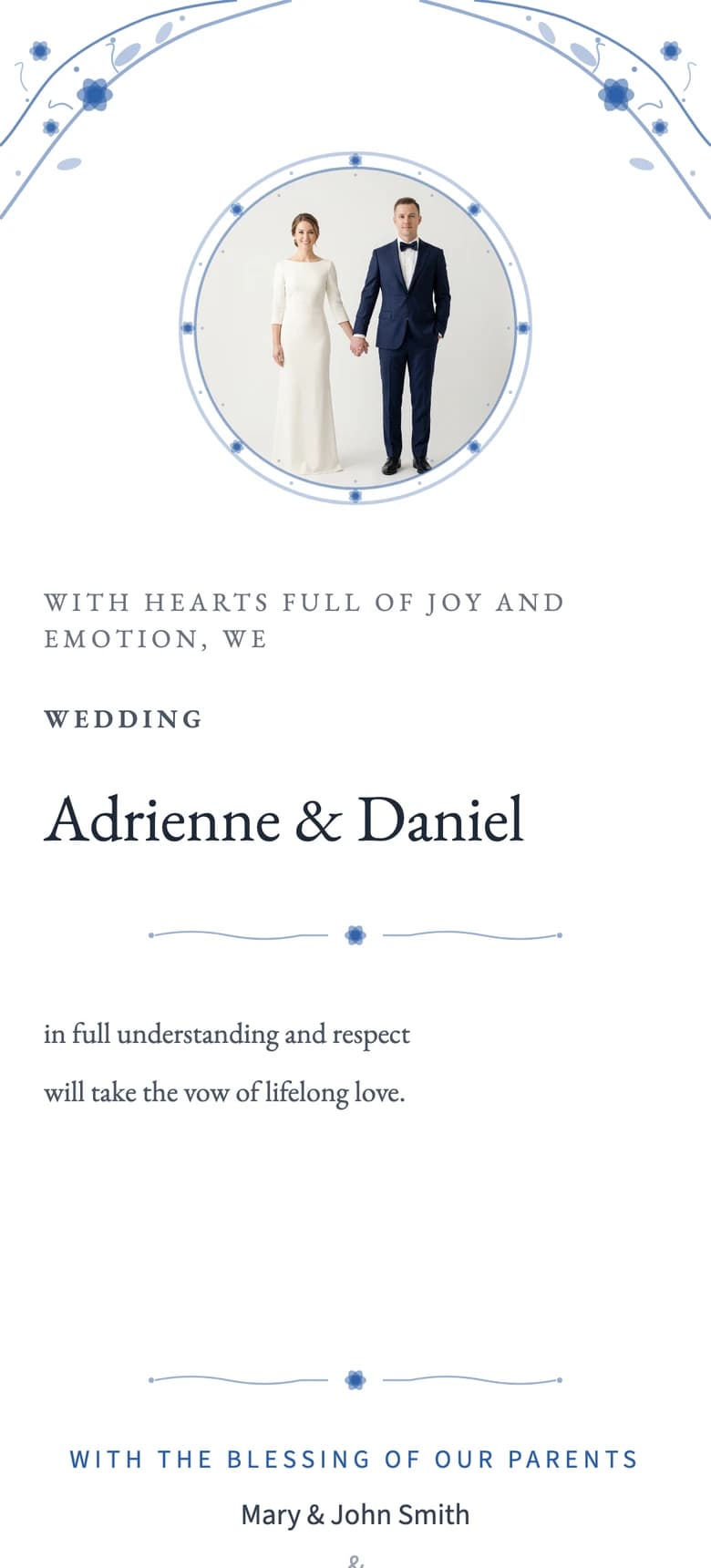
Delft Porcelain
Blue porcelain borders, a circular portrait and crisp white space.
- Where it fits
- A historic house, formal lunch or reception built around blue-and-white tableware.
- What to check
- Enter your longest names in the editor and check that the circular photograph does not squeeze them.
What you see
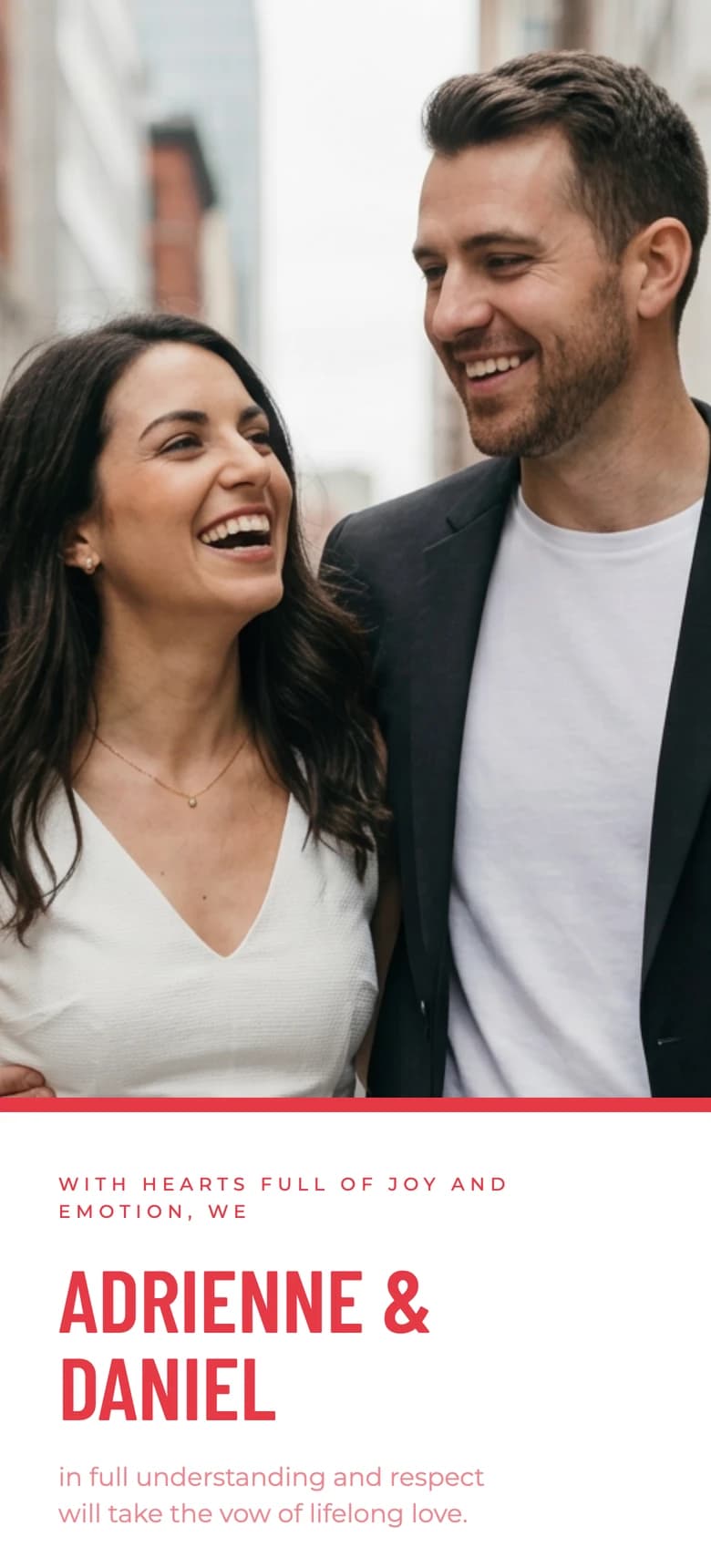
Swiss Poster
A full-bleed photograph, red bar and strict grid typography.
- Where it fits
- A warehouse, museum, rooftop or wedding with a strong graphic identity.
- What to check
- Glance for three seconds, then look away. If you remember the date and couple rather than only the red bar, the hierarchy is working.
What you see
Urban Loft
Concrete texture, copper accents and wide industrial photographs.
- Where it fits
- A converted mill, warehouse, brewery or city reception with exposed materials.
- What to check
- Lower the screen brightness and check that the concrete texture does not make smaller text look soft.
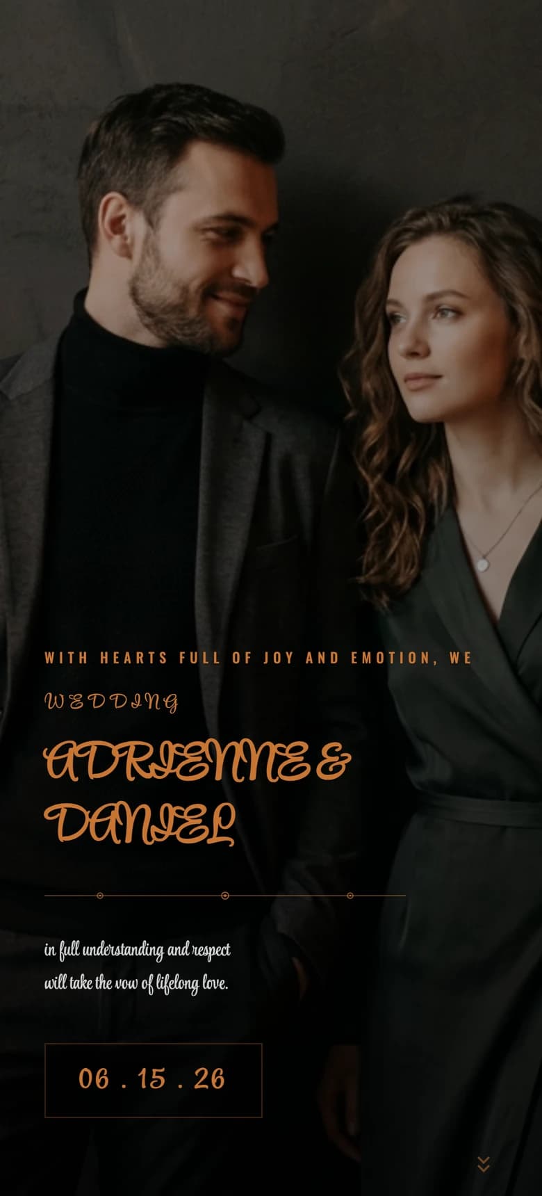
What you see
Celestial
Gold stars and a crescent moon on deep indigo.
- Where it fits
- A night garden, winter celebration or evening with a subtle celestial theme.
- What to check
- Look away after three seconds, then name the couple and date. The stars should frame those details, not replace them.

Which invitation example should you preview first?
Start with the wedding context, not the thumbnail. Preview two designs that fit the room and one deliberate contrast. Three previews will usually show whether you want typography, photography or atmosphere to lead.
| If your day is closest to this | Preview first | Compare it with | What the contrast tells you |
|---|---|---|---|
| Registry office and dinner | Le Pli | Modern Minimalist II | Folded warmth or strict restraint |
| Garden lunch | Botanical Garden II | Garden Party II | Fine illustration or personal photographs |
| Coastal weekend | Coastal Dune II | Mediterranean | Image-led landscape or drawn architecture |
| Black-tie evening | Film Noir II | Art Deco | Photography and cinematic framing or graphic ornament |
| Contemporary city venue | Editorial Minimalist | Swiss Poster | Quiet magazine rhythm or a stronger grid |
| Candlelit autumn reception | Moody Floral II | Aurelia | Deep flowers or a night-sky structure |
For the broader style decision, use the wedding invitation styles and formats guide. If you are still choosing between an image, PDF, video, wedding website and hosted invitation, compare those digital and printed invitation formats before judging individual templates.
Compare three examples on the same phone
The public pages help you make a visual shortlist. They do not test the complete guest path. After you personalise the designs, open each one through your own guest link and give it one minute on the same phone.
- First tap: Is it clear how to begin, and does the opening reveal the couple and date quickly?
- First read: Can you find the date, start time and venue without pinching or guessing where to scroll?
- First action: Is the RSVP button clear, and can a single guest, couple or family reply, including when they decline?
- Confirmation: After a reply, is it obvious that the response was received?
- Return visit: Can you reopen the invitation later and find the address or schedule again?
Repeat the final choice with larger text and reduced motion. The W3C resize-text guidance sets a useful benchmark: text should be capable of doubling in size without losing content or function. Increase browser zoom or text size to 200 percent, then look for clipped names, controls hidden behind decoration or an RSVP button that moves off-screen. This is a selection check, not an accessibility certification.
Do not treat an older guest and an older phone as the same problem. A confident guest may use a slow handset. Someone with a new phone may still prefer a call. Check the invitation on the device, then ask the guest whether the steps are clear. Offer a personal message, call or small printed card where it helps.
Saventify keeps the interactive opening, event details and RSVP in one invitation. The couple shares its link through the channel they prefer. It does not send native bulk messages or automated reminders. If you want the full path from template to published link, follow the step-by-step digital invitation tutorial.
What these examples are
The gallery links to public previews of interactive invitations, not images, PDFs or videos. If you are still choosing the format, compare images, PDFs, videos, wedding websites and hosted invitations before shortlisting a design.
WhatsApp, SMS and email only describe how an invitation reaches someone. Saventify gives the couple a link to share rather than sending a native bulk campaign. The WhatsApp, email and link guide covers what to write around it.
Questions about digital wedding invitation examples
Before you choose a template
If it were our wedding, we would preview three templates on the phone we use every day, then test the final guest link with someone who did not help choose it. Ask them to find the date, venue and RSVP button. What they find immediately will tell you more than another hour of scrolling through thumbnails.
Preview Le Pli, then make it yours
Start with the folded-paper preview. Add your names and date, then compare it with two contrasting templates before you choose.
Preview Le Pli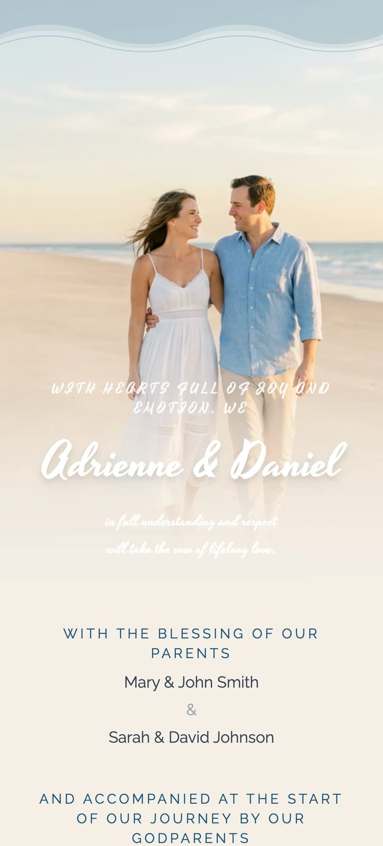
About the author
Wedding invitations, RSVP and save the date
Larisa writes the Saventify wedding guides. She covers digital invitations, save the dates, RSVP, guest lists and the templates couples actually send.
All articles by Larisa