
Authors
- Larisa
Wedding invitations, RSVP and save the date
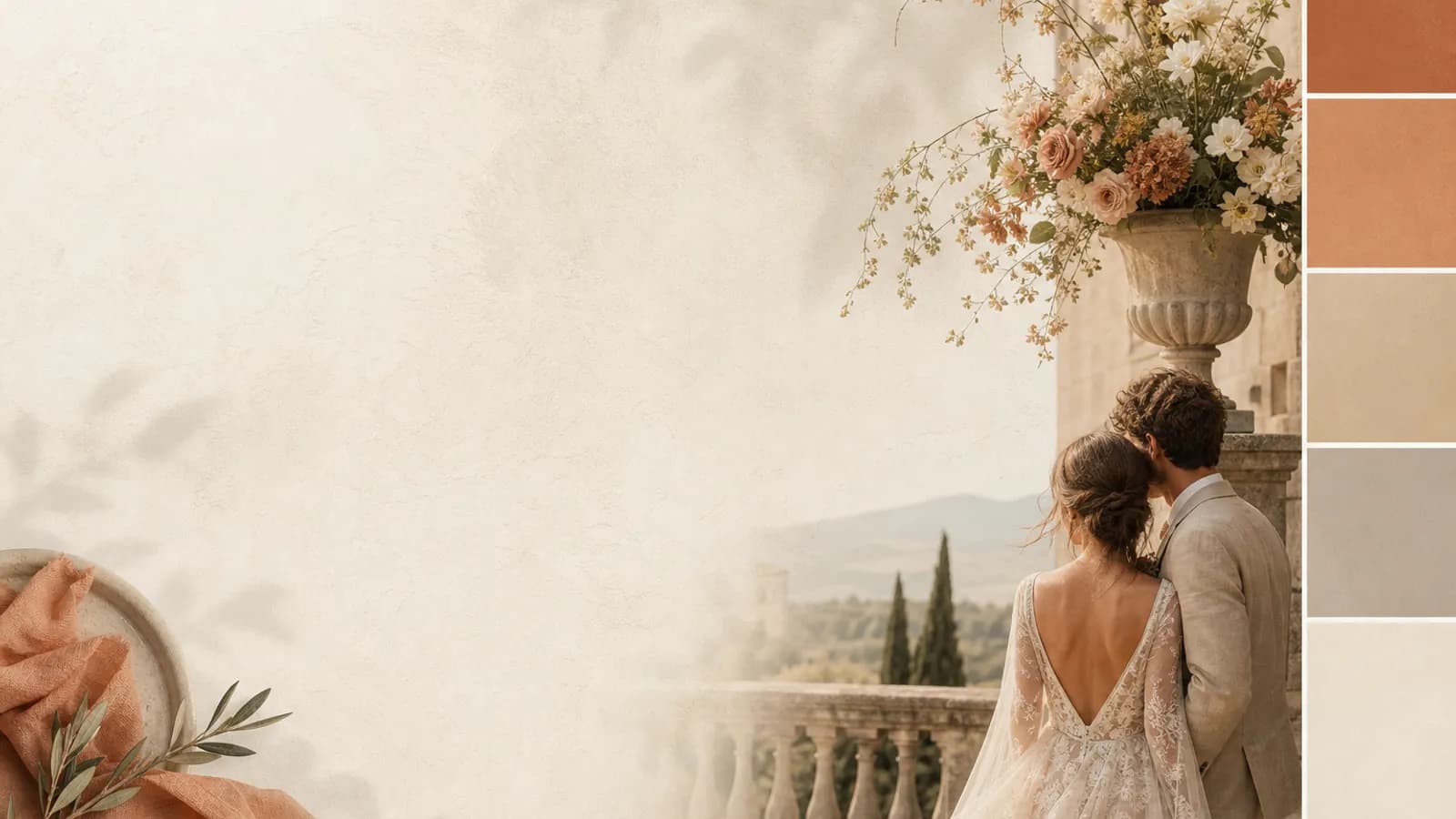
A wedding palette is the fastest way to make everything look intentional, and the fastest way to make it look chaotic. The couples who get it right are not the ones with the boldest colours. They are the ones who picked three or four and held the line. Here are palettes that work, organised by season and mood, plus the formula underneath all of them.
The formula behind every good palette
Before the ideas, the rule that makes any of them work:
- One or two main colours carry most of the day
- One accent for contrast and the small moments
- One or two neutrals to let it all breathe
Three to four colours total. The discipline is the design. Add a fifth "just because it's pretty" and the whole thing tips from composed to busy.
Spring palettes
- Sage, blush and ivory. The soft, evergreen favourite. Forgiving and gentle.
- Lilac, sage and cream. Fresh without being sweet.
- Peach, sage and stone. Warm and easy in daylight.
Summer palettes
- Terracotta, ochre and cream. Sun-baked and warm, beautiful for a long lunch.
- Coral, sand and white. Bright and coastal without being loud.
- Dusty blue, white and gold. Crisp and cool for a hot day.
Autumn palettes
- Rust, olive and cream. The season distilled, rich but not heavy.
- Burgundy, blush and gold. Romantic and deep, lovely by candlelight.
- Mustard, sage and charcoal. Modern and earthy.
Winter palettes
- Ink, silver and white. Cool, clean and elegant.
- Emerald, gold and cream. Festive without tipping into kitsch.
- Plum, charcoal and blush. Moody and warm at once, made for low light.
Timeless palettes for any season
- Black, white and one accent. The most modern, the hardest to get wrong.
- Cream, stone and sage. Quiet, natural, endlessly flattering.
- Navy, gold and ivory. Classic and confident.
Pull it from something real
The safest palette is one borrowed from the world: your venue's stone, a flower in season, a fabric you love. Materials and nature have already solved the colour theory, so a palette drawn from them rarely clashes. Photograph the thing, pull the colours, build from there.
Let the season and venue decide
A palette should agree with when and where you are getting married. Deep winter jewel tones feel odd in a sunlit July garden, and vice versa. Match the palette to the light it will live in. If you have not locked the theme yet, that comes first, then the palette gives it colour.
Carry the palette to the invitation
Your colours should not debut on the wedding day. They should arrive on the save-the-date and invitation, months earlier, as the first hint of the theme. A palette that runs from the stationery through to the table is what makes a wedding feel composed. The how is in matching your invitations to your theme, and the full styling picture is in our wedding themes, colors and decor guide. For decorating in those colours affordably, see wedding decor on a budget.
See your palette in a template
Browse invitation templates by color and mood, and send the first piece of your palette before the day.
Browse the templates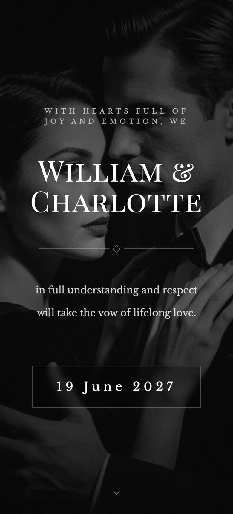

About the author
Wedding invitations, RSVP and save the date
Larisa writes the Saventify wedding guides. She covers digital invitations, save the dates, RSVP, guest lists and the templates couples actually send.
All articles by Larisa